The Story Behind the R4Style.com Homepage
The Story Behind the R4Style.com Homepage
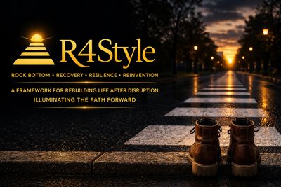
When someone lands on R4Style.com, I do not want them to feel like they have entered a polished brand before they have entered a human experience. I want them to feel something quieter and truer than that. I want them to sense that this space was built with intention. I want them to recognize that every part of the homepage—the image, the color, the light, the curb, the crosswalk, the boots, the language—means something.
The homepage is not just a design choice. It is a visual reflection of the entire R4 Style framework.
It tells the story before a visitor reads a single paragraph.
At the center of that story is a familiar image: a pair of boots standing at the curb, facing a crosswalk that stretches toward the other side of the street. The scene is set in that in-between light where the path ahead is visible, but not fully revealed. The road is wet. The city is quiet. The moment feels suspended. Nothing dramatic is happening, and yet everything is happening.
That is exactly where R4 Style begins.
Why This Homepage Matters
R4 Style was never meant to be a slogan or a polished concept detached from lived experience. It grew out of real disruption, real grief, real survival, and the slow process of rebuilding a life when the old one no longer fit.
Because of that, I wanted the homepage to communicate something deeper than inspiration.
I wanted it to communicate recognition.
So many people arrive at a moment in life when they realize they cannot keep living from the place they once knew. Something has changed. Sometimes it is illness. Sometimes it is grief. Sometimes it is trauma, burnout, addiction, loss, identity collapse, caregiving, aging, or simply the accumulated weight of too much for too long. Sometimes nothing looks dramatic from the outside, but internally everything has shifted.
That threshold matters.
The homepage was designed to hold that threshold visually.
The Curb: Where Truth Begins
The curb is one of the most important symbols on the homepage.
It may seem like a simple design element, but for me it represents the place where recognition begins. The curb is where you stop long enough to admit that something is no longer sustainable. It is where denial begins to loosen. It is where survival becomes more honest. It is where you realize that standing still is not the same as failing.
In the language of R4 Style, this is Rock Bottom.
I have always believed that rock bottom is often misunderstood. People hear that phrase and imagine spectacle, collapse, public crisis, or dramatic ruin. But for many of us, rock bottom is quieter than that. Sometimes it is the private moment when we finally tell ourselves the truth. Sometimes it is the exhaustion of pretending. Sometimes it is the realization that the life we were managing no longer reflects the life we are able to live.
That is why the curb matters.
It is not the end of the story. It is the edge of awareness.
Before there is movement, there is recognition. Before there is healing, there is honesty.
The Boots: Lived Experience, Readiness, and Choice
The boots are not decorative.
They represent the person standing in the story.
They carry weight, movement, history, and wear. They suggest that this is not an abstract journey. Someone has already walked through something. Someone has been somewhere. Someone has come to this moment with experience, not theory.
That matters to me because R4 Style was not built in abstraction. It was built through lived experience. It came out of navigating disruption, grief, addiction, recovery, resilience, and reinvention. It came out of learning how to keep going when the path ahead was not obvious and the person I used to be no longer existed in the same way.
The boots say: this framework was walked.
They also suggest readiness—but not urgency.
That distinction is important. The person in the image is not running into traffic. They are not leaping forward to prove something. They are standing at the curb, facing the crossing. There is intention in that posture. There is willingness. There is movement available, but there is also permission to pause.
That, too, is central to R4 Style.
The Crosswalk: The Space of Recovery and Resilience
The crosswalk is where most of life actually happens.
Not before.
Not after.
But in the middle.
That is why the homepage image centers the crossing itself.
The crosswalk represents the movement between what was and what will be. It is the in-between space where recovery begins, where resilience is built, and where nothing feels fully finished. It is the place where a person is no longer entirely who they were, but has not yet become who they are becoming.
A crosswalk is not random movement. It is a marked passage. It acknowledges that crossing from one side to another takes intention. It recognizes vulnerability. It creates structure in the middle of uncertainty.
Recovery, in my view, is not only about getting through crisis. Recovery is about care. It is about learning how to live differently. It is about accepting support, rebuilding trust, grieving loss, reclaiming voice, and returning to yourself in honest ways.
Resilience comes alongside that, not as a performance of strength, but as something built over time. Resilience is not toughness for its own sake. It is what gets formed when you keep showing up to your own life in the midst of uncertainty. It is what grows when you continue, even slowly. It is what deepens when you begin to trust that progress does not have to be loud to be real.
The crosswalk on the homepage is long, visible, and illuminated. That was intentional. I wanted a clear path running from the curb toward the horizon. Not because the journey is easy, but because it is possible.
The Other Side of the Street: Reinvention Without Erasure
The far end of the image matters just as much as the foreground.
There is light in the distance. There is another side of the street. It exists, even if it is not fully defined.
That is Reinvention.
For me, reinvention is not about becoming someone unrecognizable. It is not about discarding the past or pretending the hard parts never happened. Reinvention is what begins when you stop measuring your future only against the life you lost. It is the gradual work of making meaning, building structure, and allowing a new life to take shape without erasing the truth of what came before.
That is why the other side of the street is visible, but not overexplained. Reinvention is real, but it is not always immediate. Sometimes it appears first as possibility. Sometimes it is little more than a widening sense of room. Sometimes it begins with the simple realization that there is still life ahead of you, even now.
The homepage does not promise instant transformation.
It offers direction.
Why the Light Matters
The homepage is built around illumination.
The glowing horizon, the streetlights, the warm gold tones, and the sunrise motif in the logo all work together to communicate one idea: even when life is dark, the path forward can still be lit.
That idea lives in one of the core lines on the homepage: Illuminating the Path Forward.
I chose that language carefully. I did not want to suggest that R4 Style removes all uncertainty. It does not. I did not want to imply that healing is linear or easy. It is not. What I did want to say is that language, reflection, lived experience, and framework can help us see more clearly.
Sometimes the most meaningful thing we can offer another person is not a solution, but a little more light.
Light enough to recognize where they are.
Light enough to name what hurts.
Light enough to take the next step.
Light enough to believe that the crossing is not the whole story.
The warm gold palette reinforces that. It carries warmth, steadiness, and dignity. Against the darker background, it becomes even more visible. That contrast matters because so many of us do our deepest rebuilding in dark seasons. The homepage needed to honor that reality while still offering light.
The Logo and the Four Stripes
The logo itself carries the framework visually.
The four stripes represent the Four Rs: Rock Bottom, Recovery, Resilience, and Reinvention.
They are arranged as a rising path, moving toward light. That progression matters. It suggests movement without requiring perfection. It reflects ascent without pretending that ascent is instant.
Above the stripes is the sunrise.
That image captures something essential about the framework: the path forward may not begin in brightness, but brightness can still emerge. The light is not separate from the path. It rises through it.
The logo is simple enough to read clearly while still carrying layered meaning. It is direct, grounded, and intentional. That mirrors how I want the framework itself to function.
The Words on the Homepage
The homepage text was written to make the framework immediately understandable.
Rock Bottom • Recovery • Resilience • Reinvention
Those four words appear prominently because they are the foundation of everything else. They are not just themes. They are the stages of a lived framework. Not perfectly linear. Not one-size-fits-all. But real, recognizable, and deeply human.
Below that appears:
A Framework for Rebuilding Life After Disruption
That line matters because it names the purpose of R4 Style plainly. This work is about rebuilding. Not returning to some untouched version of life. Not forcing ourselves back into an old identity. Rebuilding. That word allows for damage, change, adaptation, and design. It suggests that something real can still be created after disruption.
Then comes:
Illuminating the Path Forward
That line adds tone and intention. It speaks to what I hope this space offers people: not pressure, not performance, not false certainty, but light, language, and a way to move through what comes next.
Together, those lines form an invitation.
What I Hope Visitors Feel When They Arrive
When someone opens the homepage, I hope they feel seen before they feel instructed.
I hope the image tells them they do not have to have everything figured out.
I hope the curb gives them permission to acknowledge where they are.
I hope the crosswalk reminds them that the middle is not a failure.
I hope the light in the distance reassures them that life can still take shape beyond disruption.
I hope the overall feeling is calm, grounded, and human.
Not rushed.
Not polished to the point of losing truth.
Just honest.
Because honesty is where healing begins.
Closing Reflection
If you have ever found yourself standing at a threshold in life—knowing something has changed, but not yet knowing exactly how to move forward—you are not alone.
That space matters.
The curb matters.
The crossing matters.
And the other side of the street matters too.
R4 Style was created to offer language, structure, and hope for that journey.
Not because the path is always clear.
But because even in the dark, it is still possible to find light enough to take the next step.